The Canadian artist interweaves themes of appropriation to paint a vivid interpretation of art’s intricate relationship with wealth and decadence
Affluence, class, patronage, and desire are facets of the art industry that surface in various contexts in varying hues. When we interact with art, questions like: what attracts our eye, what meaning does it contain, and how does it attract and shape our sense of value come naturally to the forefront. In his inaugural solo exhibition Look at This Stuff Isn’t It Neat opening today at Joshua Liner Gallery in New York, LA-based painter Andy Dixon explores these queries in a delightful display of color and appropriative imagery.
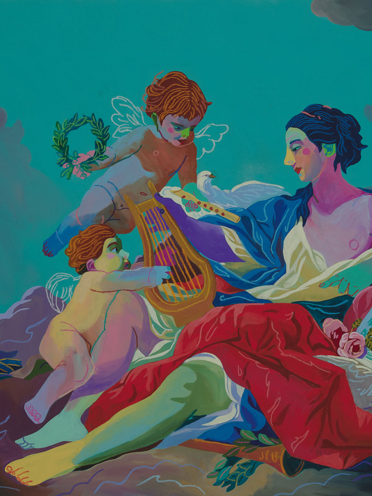
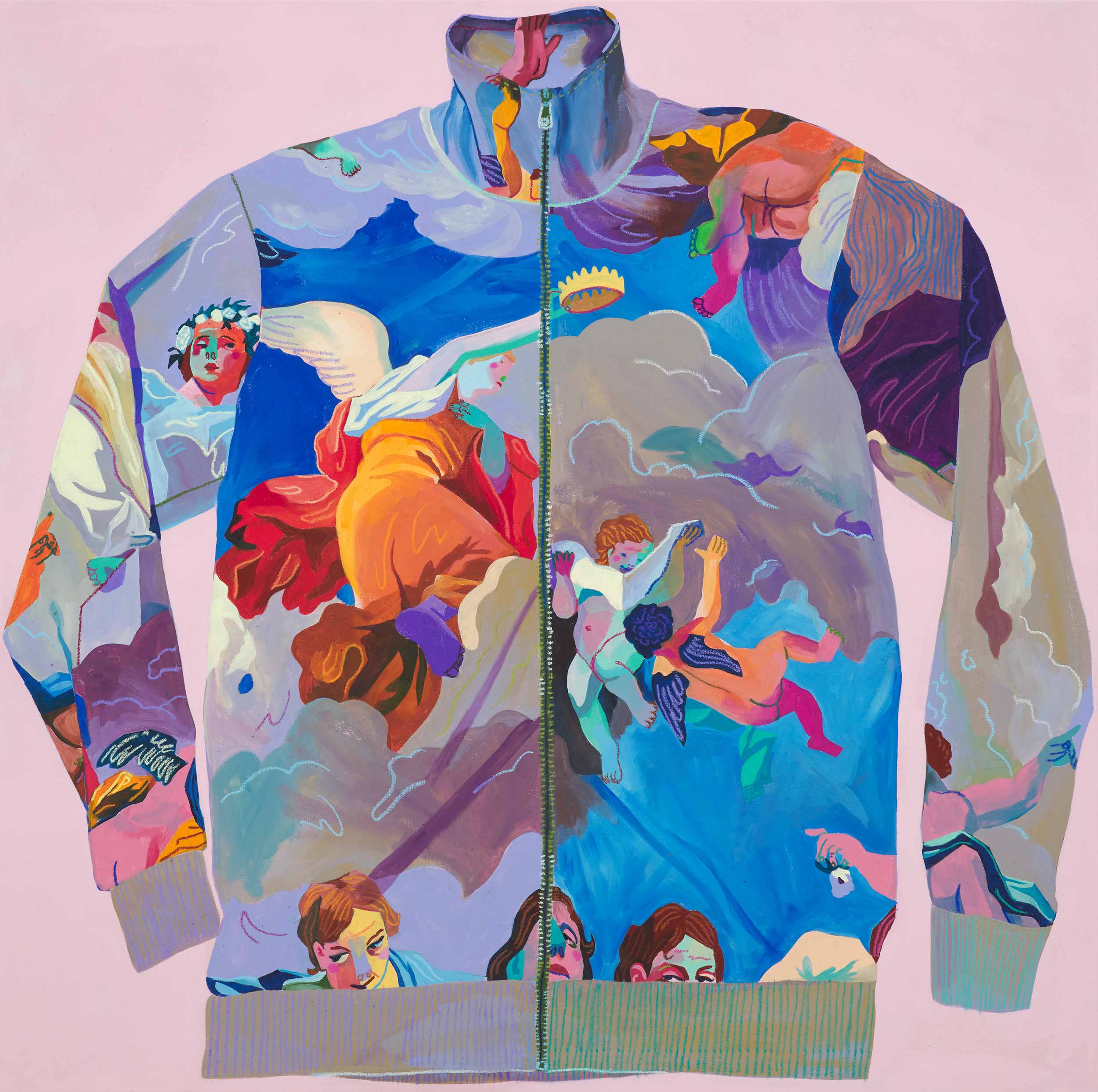
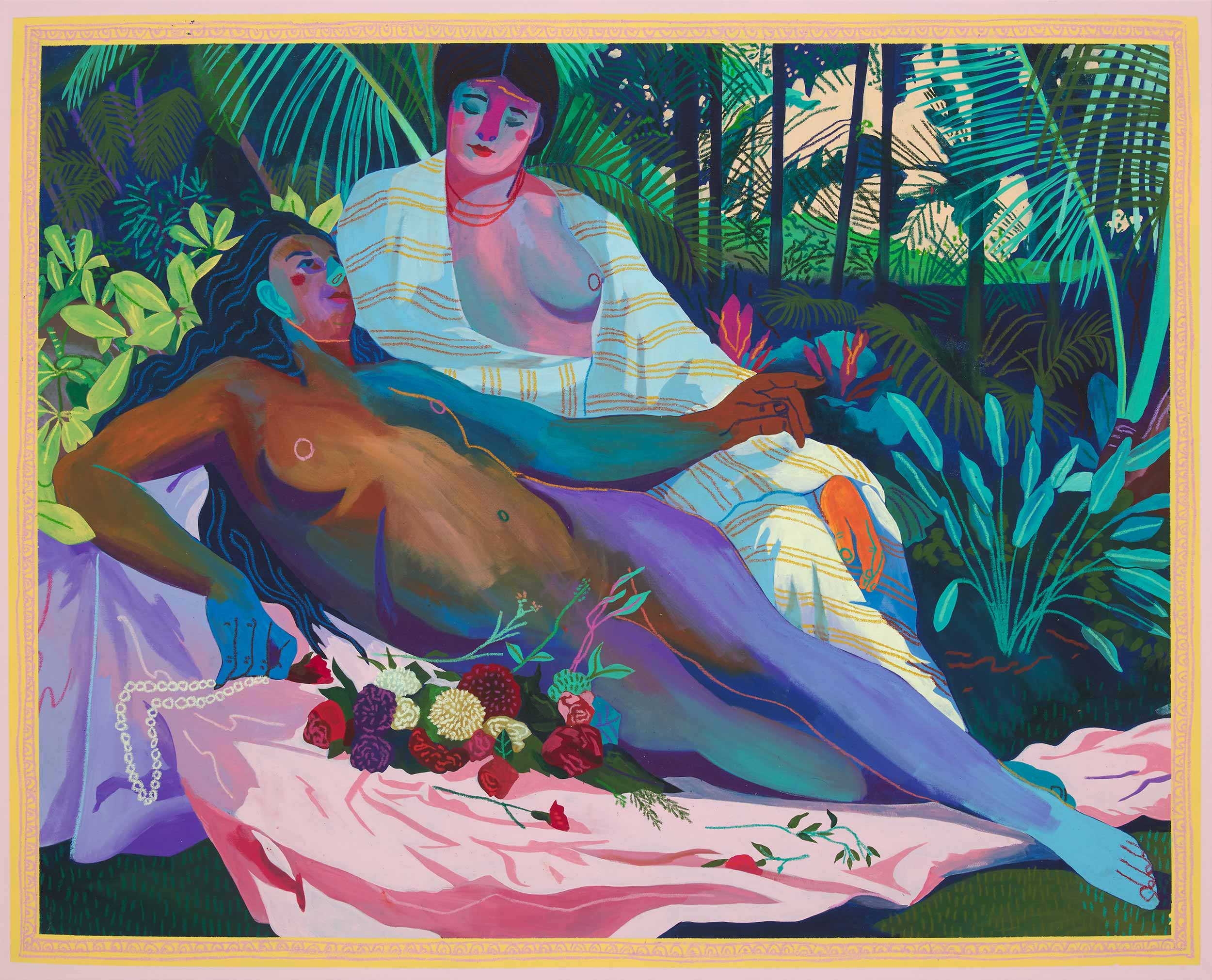
In Look at This Stuff Isn’t It Neat, Dixon concerns himself with the “never-ending chain of alchemy” through contemporary representations of luxury objects because, in his view, a depiction of a luxury object becomes its own luxury object as a result of its recreation. Dixon’s affection for recontextualization beams through in animated reworkings of classical paintings such as Francois Boucher’s “Allegory of Music” and Pierre-Auguste Renoir’s “Two Bathers.” The painter and former musician also makes a cheeky nod to the fashion industry with an installation of a nine by seven foot, hand-painted Versace shirt which hangs in the gallery on a wooden clothes-hanger.
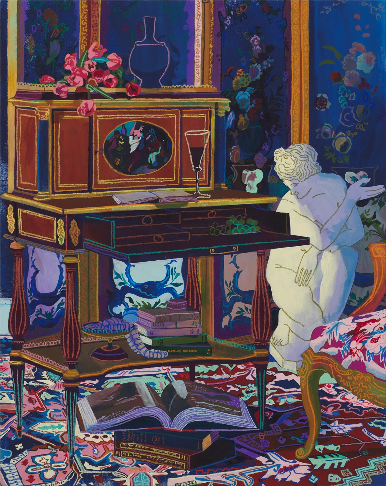
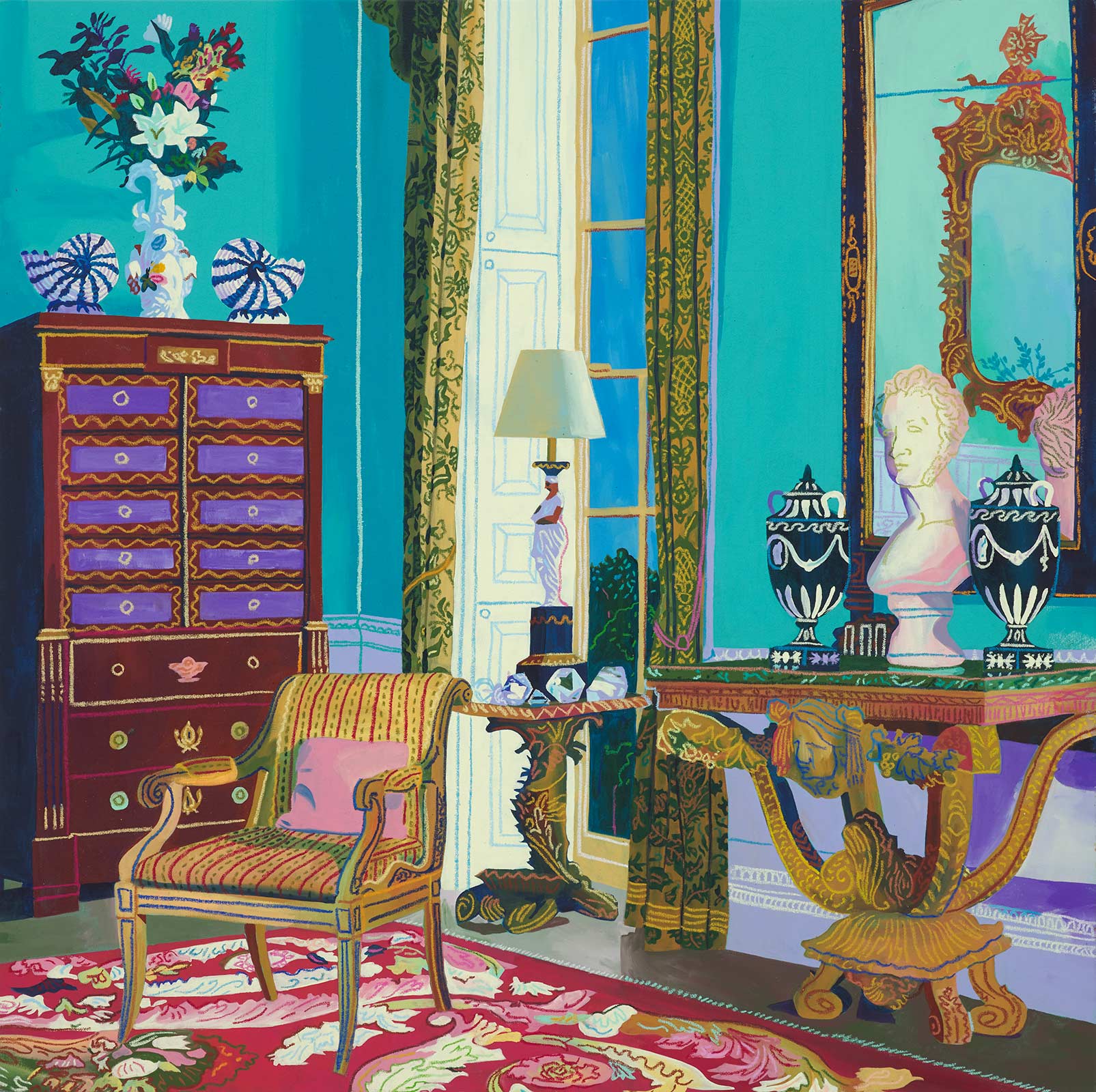
Depictions in the exhibition’s paintings span rococo rooms filled with imperial furniture and statues to bourgeoise salon rooms decorated with violins and pianos and fancy fruit. Referring to these symbols of wealth as merely “stuff” is a humorous confrontation that questions what we deem desirable. Look at This Stuff compels its viewer to take a deeper look at our notions of value and to tap into the romantic melee of the art world, complete with its undertones of wealth, patronage, and luxury, with a paradoxical, even lighthearted approach.
Kaylee Warren—Look at This Stuff Isn’t It Neat roots itself in themes of patronage, luxury, and the relationship between art and wealth. While wealth can be rather apparent in various sects of the art world, it can still be sort of dicey and complex to talk about. Why do you think that is?
Andy Dixon—I think there’s an idea that once money is introduced into art-making, the work is somehow no longer pure; that if an artist is making work hoping to sell it, he or she is compromising his or her vision. But the contradiction within this idea is that money is involved no matter what. Canvas costs money, paints cost money, studios cost money, and living one’s life costs money. It’s already in the equation. I grew up in the DIY punk scene where “selling out” was a huge sin because of this idea. It’s a noble concept in a way but has holes in it. Firstly, the concept that it’s somehow easier to make work that resonates with a large populous instead of making esoteric work that only few enjoy is iffy at best. Saying something important and figuring out how to say it in a way that connects emotionally with culture is, in my opinion, a mark of the highest genius. Secondly, not “selling out” becomes a kind of crutch artists can use to protect themselves from real vulnerability—the vulnerability it takes for an artist to say “I hope you like it.” In other words, this attitude of “You don’t like it? Well that’s just because the work is too complex for the average person to understand” leads to an artist making work that’s hard to enjoy in order to give the illusion that it has depth instead of putting in the work to actually give their work that depth.
Kaylee—I’ve read that your work is heavily inspired by the appropriation and recontextualization of images. This springs forth fascinating questions about what we value in art, why we value it, and how we arrive at this value judgement. You pose the question “What gives my version its value?” I love this query. Do you think value arises from the technical mechanics that went into its creation or from audience reception, especially from critics and buyers?
Andy—I definitely do not believe that the value of art does or should come from the strength of the artist’s technical prowess just as I don’t want to listen to music made by someone who has locked themselves in their apartment, practicing non-stop to become the world’s fastest guitar soloist. My work is intended to make one think about the value of things. If my depiction of a master-work doesn’t contain any of the elements that the art market would say gives the original painting its value, such as antiquity, provenance, or even technical prowess, and yet there it is on the gallery wall being sold, then I’m pointing to a kind of magic in art—the same magic that I believe Duchamp was pointing to when he would argue that art is what the collective audience makes of it. I’ve simply channeled that concept into the realm of money. He asks “What is art?” and I ask “What is expensive?”
Kaylee—Your style throughout all of your works is denoted by a wonderfully vivid, fauvist color scheme and intricate attention to detail. Tell me more about this. How did you find yourself drawn to this style?
Andy—I have always been drawn to aesthetics and colour even as a child. It’s something I can’t explain—I am constantly judging the visual stimuli that I come across minute by minute. Also, I think that since my work is about the human condition and the comedy of desire, in order to complete the circle of irony and deliver a kind of punchline, my paintings need to look like candy-coated desire itself.
Kaylee—Some of the works in this exhibition include images that were pulled from electronic sources like Christie’s Instagram account and designer shopping websites. How has the Internet possibly informed your art practice or the way you look at the art world, especially within the conversation of appropriation?
Andy—I’ve been pillaging pop culture on the internet since my experimental music days when I’d plunder SoulSeek for top 40 MP3s to sample, chop up, and obscure, so it’s been a huge force in my artistic life for a long time. To me, the internet IS culture so it’s naturally where I go to involve myself in it and to take things from it.
Kaylee—The exhibition title draws from the opening lines to The Little Mermaid song “Part of Your World,” a song in which Ariel gestures to her material abundance under the guise of someone who “has it all.” However, she still longs to be free and a part of the everyday world, sans materiality. How much of this message imbues itself into this exhibition?
Andy—That’s exactly it. Again, it comes down to the comedy of desire. We all want more. In a lot of ways, that’s a good thing as it’s our reason to get out of bed in the morning. I’m excited to hit my studio every day to make more, say more, achieve more, gain more, but I’m not so foolish as to not understand there is no finish line to that. We will always be hungry.
“Look at This Stuff Isn’t It Neat” is on view at Joshua Liner Gallery until March 30, 2019.


