The Cuban artist joins Document to discuss the joys of contaminating space, the necessity of repositioning, and why he favors horizontal monumentality over hierarchies
White walls. Thoughtful postures. Careful silence. Don’t touch. Observe things, not people. Don’t spend too long looking, but only long enough. The explicit and invisible rules of the spaces in which we consume art inhibit engagement—often more so than necessary for the human decencies desired and material preservations required.
Misread Unread Read Re-read Misread Unread Re-read engages with, questions, and dissolves those boundaries that reinforce hierarchies. Best-described as a program, MURRMUR is made up of branches that morph and intertwine with one another: prototypes, projects, and presentations by artists, designers, writers, poets, and publishers. Originating with no clear picture of what it would become, the program is built from a commitment to challenge our understanding of exhibitions and what it means to read, publish, and distribute ideas. The fragments that compose it are only connected by location and a shared will to dismantle traditional structures of consumption. Hosted and orchestrated by the Institute of Contemporary Art at Virginia Commonwealth University’s Senior Curator and Director of Programs Sarah Rifky and Assistant Curator of Commerce and Publications Egbert Vongmalaithong, MURRMUR opened in fall 2022 and will unfold through the coming seasons.
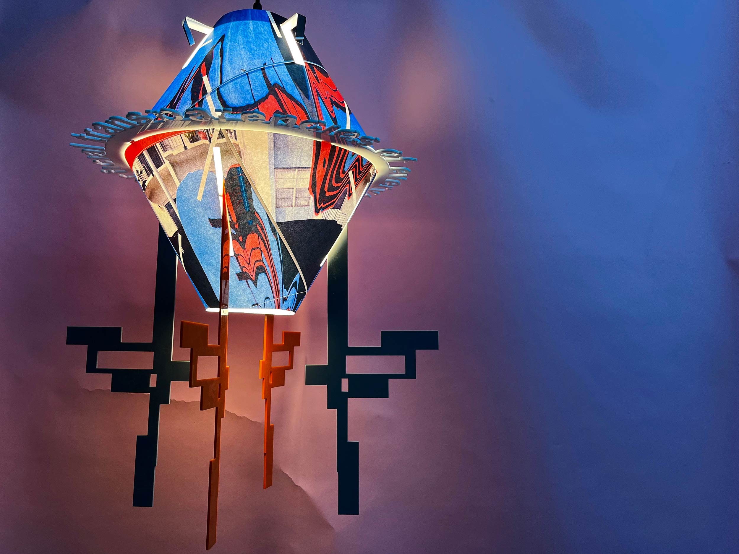
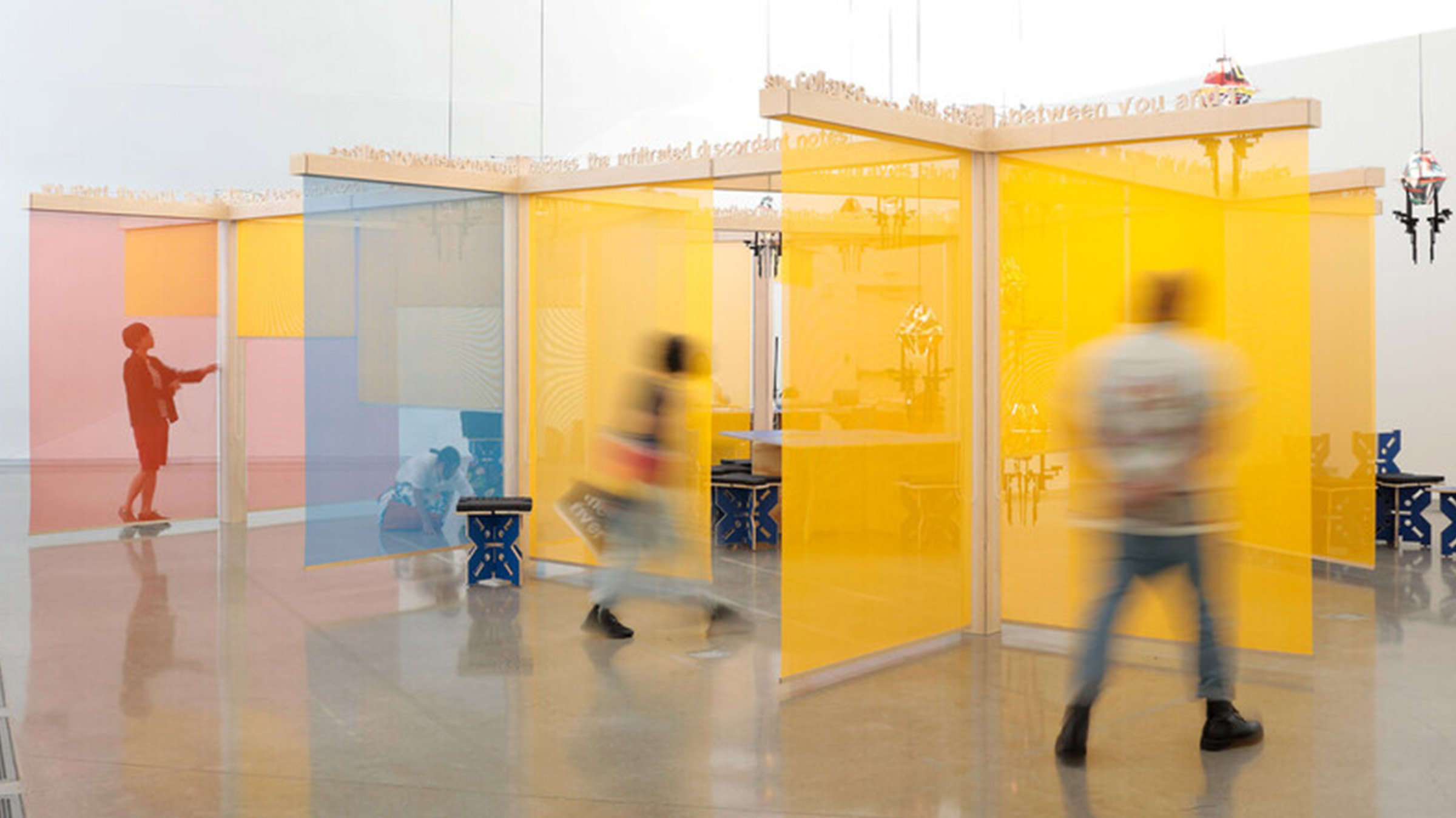
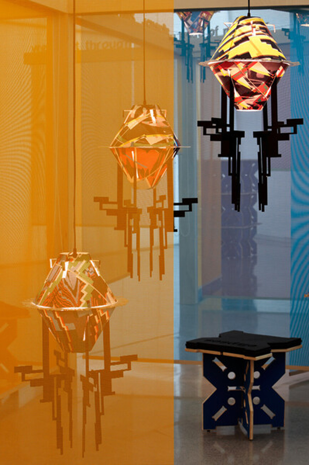
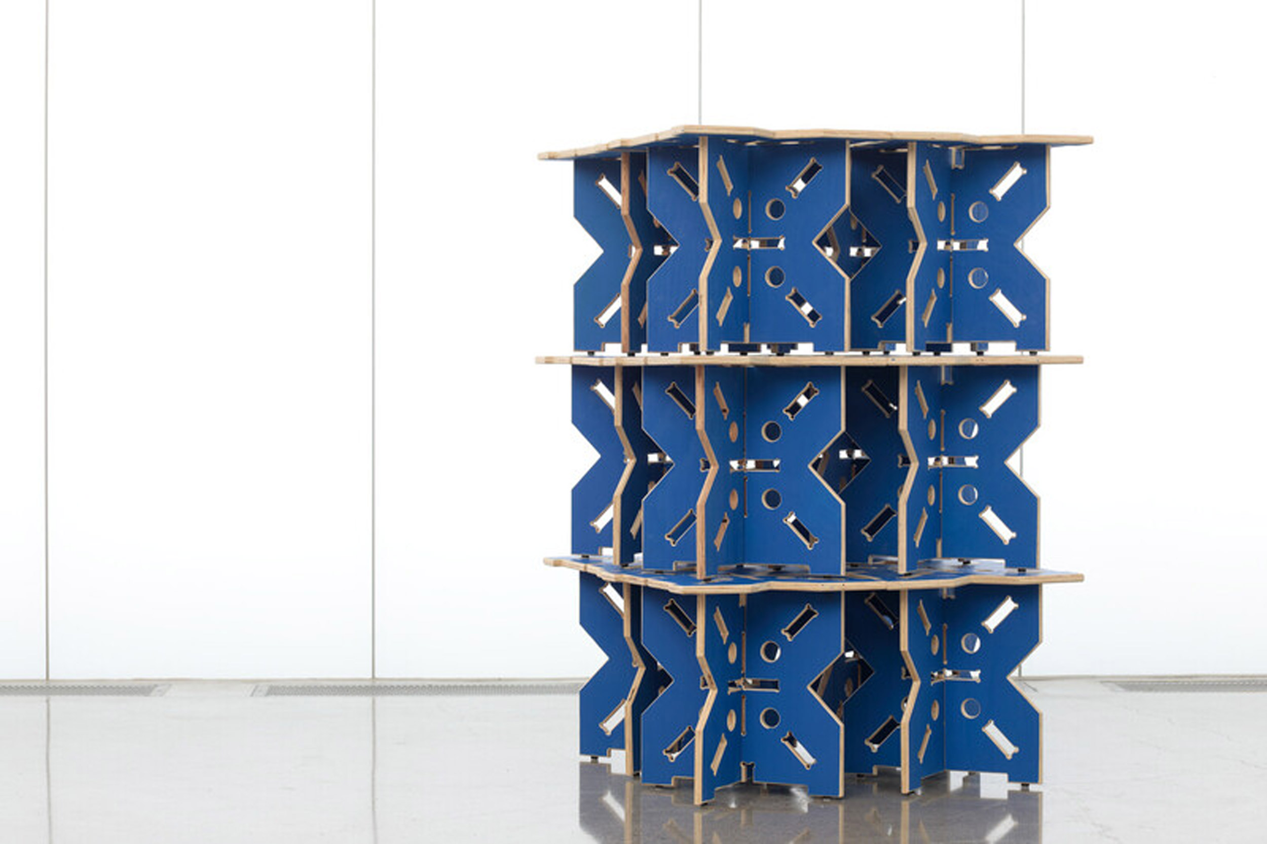
Its centerpiece of sorts is The Medium is the Massage—an immersive work that might usually be described as an “exhibition” (it’s a temporary piece of art staged on its own in a museum), but Rafael Domenech, the artist responsible, favors the term “publication.” The project takes its name from the 1967 book, originally an accepted accident. For Domenech, the punning typo “encourages consideration of the ways print publication combines the flow of informational exchange with the commodification and tactility of objecthood.” The hierarchies that seem inherent to an art space—between artist, visitor, staff, and object—are flattened. You can touch it. You can take from it. You can participate in it. You can invent new meanings and functions for it.
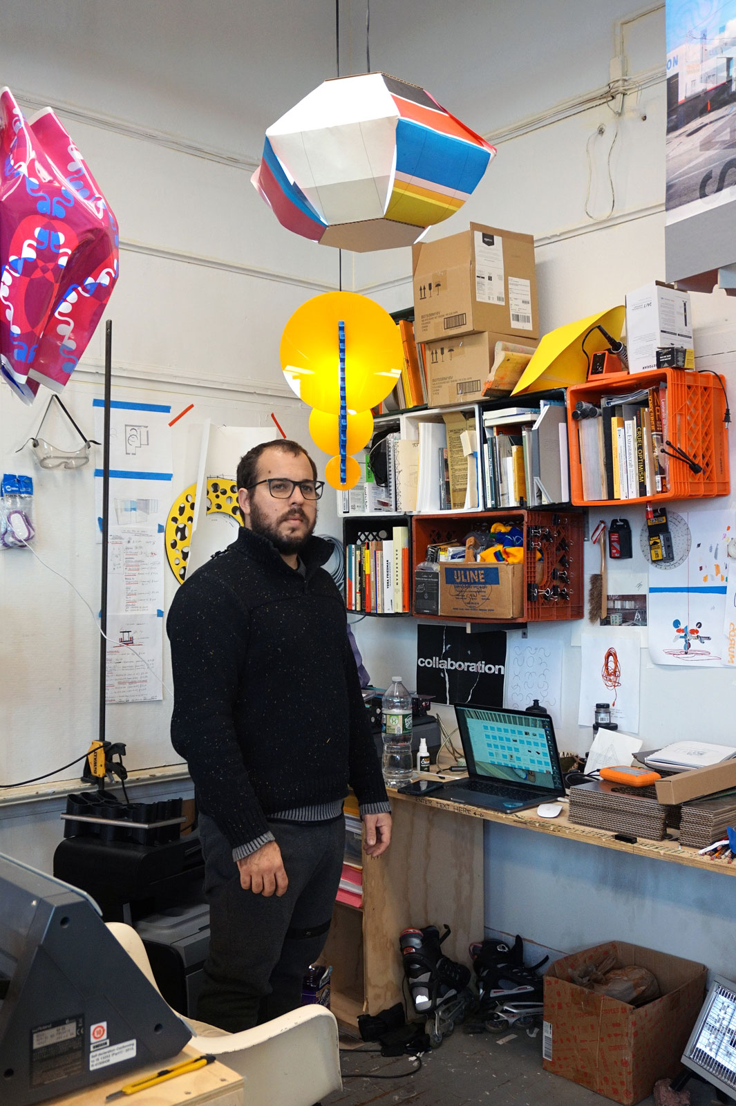
Situated on the top floor in an awkwardly shaped room with tall ceilings, the Cuban artist’s creation is situated in the same space as the museum’s offices, with no barriers between it and the often-occupied desks of staff. It’s jarring to encounter, as the galleries below operate in a formal manner that might indicate Domenech’s would do the same. But The Medium is the Massage is missing that same rigidity, security, formality. How you approach it is yours to decide. And like a book, the second time you encounter it will never be quite the same as the first.
For Document, Domenech expands upon the conceptualization of his project for MURRMUR and discusses the joys of contaminating space, the art of repositioning, and why he favors horizontal monumentality over hierarchies.
Megan Hullander: Where did the concept for The Medium is the Massage originate?
Rafael Domenech: I don’t necessarily feel attracted to exhibitions [where] the space becomes a repository, rather than a material or an active component. For a few years, I’ve been [exploring] how to generate projects from the methodologies or procedures of the publishing industry. I was working on investigations into pavilions or architectural scale structures that would or could function as a publishing platform. It was about reformatting space, coming from philosophical discourse around migration, edges and peripheries through literature, poetry. I’m fascinated by concrete or experimental poetry, or experimental language and how it’s presented—liberating itself from grammatical structures. At the time, the conversation was, What does it mean to make a show or a project? What does it mean to inhabit a space in the museum, in a place I’ve never been to, and where I have no communal ties? An exhibition contains specific historical markers, nominations of objects, and their political and social interactions with the viewer. I said, ‘Can we stop talking about an exhibition and call it a publication?’
Megan: How did the existing space inform the construction of the work?
Rafael: I always say that the first two materials of a project are money and space, and they’re not just enablers. The [ICA] is a complicated building; it’s almost nonsensical in its construction. This room is vaulted. It’s kind of a mistake. It feels like a church or cathedral, and yet everything about it is faulty. There’s no way you can clearly communicate through it; the proportions are completely off. At its base, there’s a lighting system, but it’s almost rendered obsolete because of the window. Everything about this space is off—not in a negative way, but off.
To address it in an interesting manner, I needed to create or develop a space within a space, from a functional perspective. When you enter [an exhibition], there’s a limitation to what you can do or how you can operate. And I think that the first reaction was [that] this space was almost rendering itself unusable. We needed to develop a project that could tactically insert itself in the least invasive way possible, [while] maximizing the capacity to generate something new.
You could think about a billboard and a city. The way that a billboard is placed is based on navigations around the urban space—like traffic arteries, circulation, or whatnot. This was a little bit like that. How do I—and we, as a team—insert this scenario or proposed structure that can create a scenario beyond the standard understanding of this space?
Megan: And how did your idea of horizontal monumentality function in that?
Rafael: I am not interested in hierarchies, or points of view that speak from hierarchical perspectives. I’m interested in overlap, flatness, interconnectivity, and relationships that happen on the same plane. It’s about understanding material circulation across the globe. It’s an ongoing investigation of how modernism evolved into neoliberal, economic infrastructures around urbanism and architecture, and what the implications of the digitalization of communications did to interconnectivity and networks. It’s about developing a platform—a framework—where a number of situations can be generated. We are always negotiating our place.
Horizontality is a battle against vertical monumentality. I don’t think that monuments are interesting pieces of architecture—especially in the context of Richmond, where there have been these immense battles around monuments and bases. The immediate response—I need to make this tall thing—makes you feel overwhelmed, which was the objective of the church developing cathedrals in Medieval times. Instead of that, I anchored it to the ground. The pavilion is 96 inches [tall], the standardized height of a ceiling in a home, so there’s a relatability between commonly-inhabited scales—which is the opposite of the room [at ICA]. We ignored two-thirds of its height. Everything happens in or beneath it.
“I am not interested in hierarchies, or points of view that speak from hierarchical perspectives. I’m interested in overlap, flatness, interconnectivity, and relationships that happen on the same plane.”
Megan: It can be disarming to walk into, in that workspaces exist beside it, and it functions as a classroom at times. Have you been able to watch people experience The Medium is the Massage?
Rafael: A big part of being in a space with others is this voyeuristic notion of looking. I wanted this exhibition to have a moment of strange negotiations around visitors—looking at someone else looking at something, or doing something—who are sharing space in a diversity of ways. You’re aware of someone if you’re crossing them in the lobby, but it seems that when you are in a gallery space, you [have] more awareness of that moment. There might be a class, a bookmaking session, someone using the space as an office, or taking a nap. Who knows? A goal of the show is to find ways to contaminate that space in different manners where there is a cluster of functions happening.
Megan: Did you include anything within its design to signal to visitors that it doesn’t have the same rules as a traditional gallery space?
Rafael: I’m not into instructions. And that comes from an experience I had when I arrived in the United States, and my English was very, very little. This street had a sequence of businesses from different parts of the world. I [thought], When does the text become ornamentation? What allows that is access to understanding. [When there is] a lack of indication, it’s an interesting moment to negotiate your space and push the boundaries of what it means to be there.
There’s this ongoing process of renewal; you could go through the show and see something today that you may not see tomorrow, or the day after—but you could see some iteration of it.
Megan: There’s a distinctive range of materials, like construction mash plywood and semi-translucent screens. What was the thought process in choosing these materials to connect with the concept of the work?
Rafael: All the materials in the exhibition are tied to the city. These materials are utilized every day to construct and reconstruct the city—the places we are contained inside or around. Those particular materials are linked to the history of display design, display construction, and professional and provisional structures. The art space is a space of repositioning and reevaluation and speculation. This is an attempt to reposition one’s relationship to these materials, where they start to detach from their functional origin. I don’t think about million-dollar ideas, because I don’t have a million dollars. But I can compose an elaborate and complicated scenario with the same materials that anyone else has access to.
“If the space is a publication, it’s about generating moments, experiences, images, content, and how they’re bound—the common spine is the space.”
Megan: What about Marshall McLuhan’s The Medium is the Massage resonated with the project, enough to use it for the title?
Rafael: The Medium is the Massage is a book I hold very dear to my heart, because of its experimental production and understanding of generating a situation in the format of a book. But it’s also the beginning of understanding the relationship between image circulation and image collapse. And that predates the internet and its functions.
What resonated with the project was not the book in and of itself, but the methodologies of composing it. It was a conversation between three people: Marshall McLuhan, Quentin Fiore, and Jerome Agel. The core objective of the show was to compose a situation from a diversity of moments, or to propose that as a methodology for constructing space, rather than developing one line or one idea of how this thing would evolve.
If the space is a publication, it’s about generating moments, experiences, images, content, and how they’re bound—the common spine is the space. That’s why the show expands for such a long time, because you need time to commission and publish and circulate content—it cannot happen overnight. The function of the show is [to illustrate] the capacity of a place or object to perform a diversity of functions.


