At Miami Art Week, the founder of Reddymade joined Document to discuss neuroaesthetics, the creation of her Lexus-inspired sculpture, and technology as an extension of personhood
When Indian-American designer Suchi Reddy first got her start, the late Zaha Hadid was the only starchitect who was female and a person of color. But the whiteness and masculinity that dominated the field didn’t deter her. As the lead of Reddymade, a 15-person studio in New York, Reddy fuses design and psychology to create spaces that influence the ways in which we live, even within her own 375-square-foot home in the West Village.
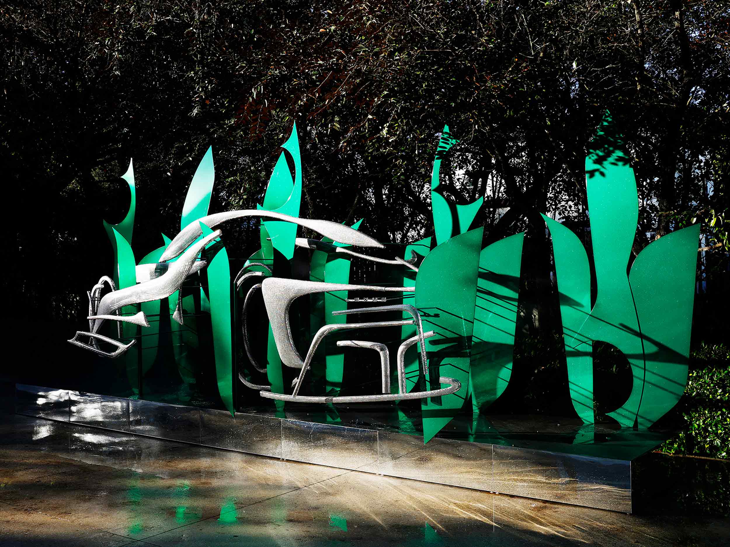
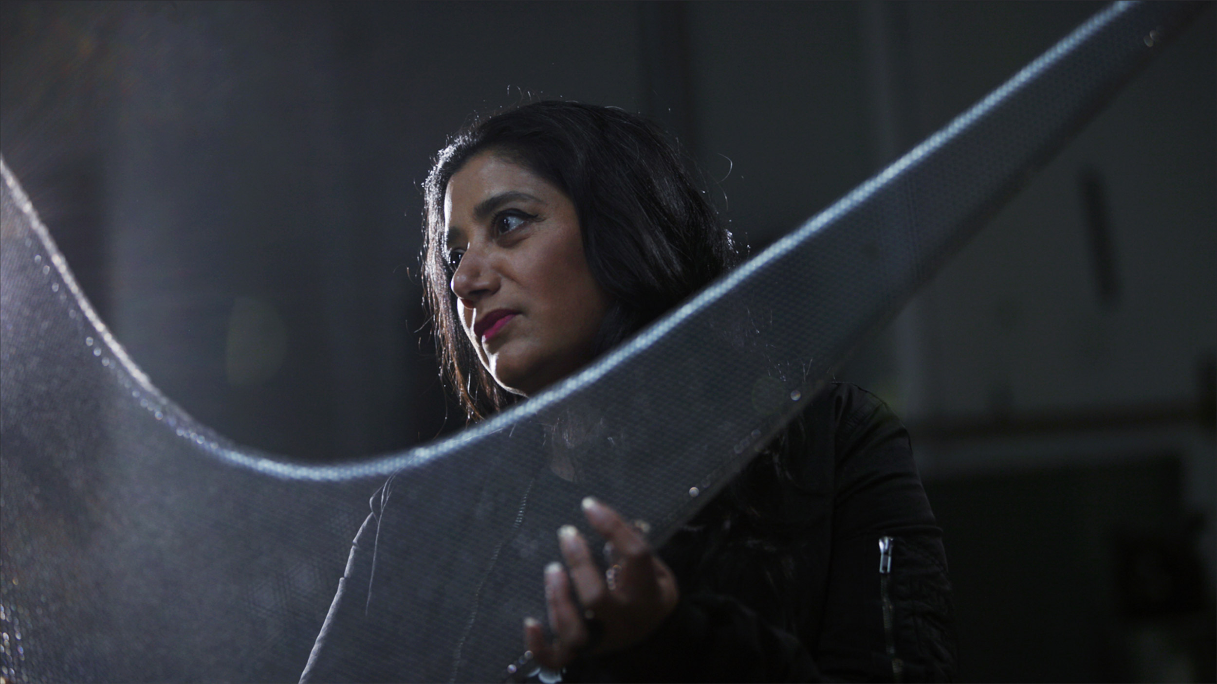
Reddy uses the idea of neuroaesthetics—the study of the neural consequences of contemplating a creative work of art—in her practice. So far, Reddymade designed Google’s first retail outlet in Chelsea, as well as a number of residential spaces. Most recently, Lexus tapped her to create a sculpture for the Institute of Contemporary Art, Miami, situated in the Sculpture Garden alongside pieces by Mark Handforth and Allora & Calzadilla. Made of powder-coated aluminum, the site-specific sculpture is abstract, but takes inspiration from the “shaped by air” quality of the Lexus Electrified Sport. On view at the ICA through December 11, the green and aluminum colored installation, made from leaflike shapes influenced by Henri Matisse’s paper cut-outs, finds its home among the foliage and fauna of the garden, its spiders creating webs within the sculpture.
At Miami Art Week, Reddy joined Document to discuss neuroaesthetics, the creation of her Lexus-inspired sculpture, and technology as an extension of personhood.
Ann Binlot: Have you exhibited during Miami Art Week before?
Suchi Reddy: It’s my first time exhibiting. I’ve been here many times—consuming, shall we say?
Ann: Tell me about your philosophy of neuroesthetics. What does that mean?
Suchi: It’s a translational field that has been around for, I would say, 15 to 20 years. There’s a huge group of people working in this field—environmental psychologists, cognitive scientists, artists, architects, designers—thinking about how your environment triggers, acts upon, and influences your brain and your body. And that could be anything. It could be an artistic experience or aesthetic experience. It could be a space.
When I was growing up in India, I had this epiphany that my house was making me a different person than my friends. From that time, I’ve thought about the power of a space, the power of an experience, and that carries through in all of my work. Whether [it’s with] homes, commercial projects, installations, I’m always thinking about how I can create this engagement. How can I create a sense of discovery [and] wonder? If it’s a personal space, how [is it] helping you thrive? It adds an element of thoughtfulness that’s influenced by research. We’ve been looking at everything from how to design for neurodiverse and neurotypical people to how to make hospital rooms that allow people to recover faster. I’ve never been able to separate one thing from another; I [have] this totally multidisciplinary brain.
“This doom and gloom thing is in our hands to control. It’s about us. I want to emphasize self-awareness, human growth; that’s really what’s the most inspiring to me.”
Ann: How do you study how a space affects one’s mind?
Suchi: We did an exhibit with Google during Salone [del Mobile]. I created three different spaces. And they all had the same function, but different design. At the end of it, the band [that visitors had to wear in the space] registered for bodily metrics. Science has to play into everything that we do.
Ann: What’s interesting to me is that we’re organic creatures. We are technically part of nature, but with capitalism and Industrialism, we’ve removed ourselves from that. How do you return to the way nature intended us to live?
Suchi: There’s an amazing architect and philosopher named Sarah Robinson who wrote a book called Architecture is a Verb. She says things like, ‘If you think about a spider, you never think about it without its web.’ It’s an animal in its habitat. We spend 90% of our time in built environments. Somehow, the human consciousness thinks it’s running around without anything affecting it—which is bullshit. I think good design and good art give you a new perspective on something. They show you how to look at something, teach you something about yourself. Through this installation, I was trying to bring home the point that an object—anything that we make—and its environment are really intertwined.
Ann: Tell me how you did that with the piece Lexus commissioned you to do for the ICA.
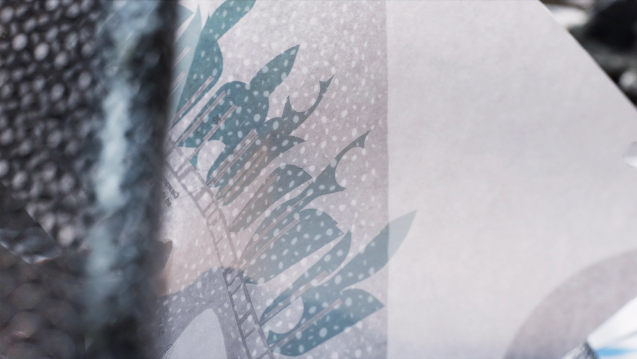
Suchi: All the pieces in the sculpture are pieces of the car. Like Matisse, I was making cutouts and sticking them together. I was like, Well, this looks like a jungle, and here are the shapes of the car. I’m gonna meld one and the other—but they’re all the same thing. They’re all from the same object. To really show that we’re intertwined, I used natural things like mist and light and air to enhance it. I’ve watched it with all kinds of weather, all kinds of light. It’s been lovely to see the shadows of the leaves and the reflections when it gets wet from the rain and the spiders making nests in it, which they’ve been doing very diligently. It’s been wonderful to see it become part of nature.
Ann: Yeah. I saw it at dusk, just after a rainstorm.
What were the materials and the process used to make the sculpture?
Suchi: It was an analog approach to something that’s as high-tech as a car these days. I had the wonderful opportunity to go to Lexus’s Calty Research Center. It’s closed-door. Nobody’s allowed in there. It’s where they make all their super secret [designs]. They gave me a solid object, a car, and I was like, How can I make this? I was thinking mist, I was thinking, How do I represent this and put it outside in the daylight? I went in there, and asked about the shape of the car. They said, ‘Well, this is responding to the air. It’s responding to the wind—it’s shaped by air.’ [It needed to] be durable outside and work well during both day and night.
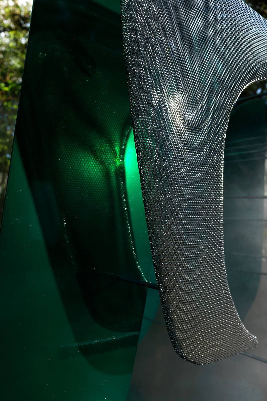
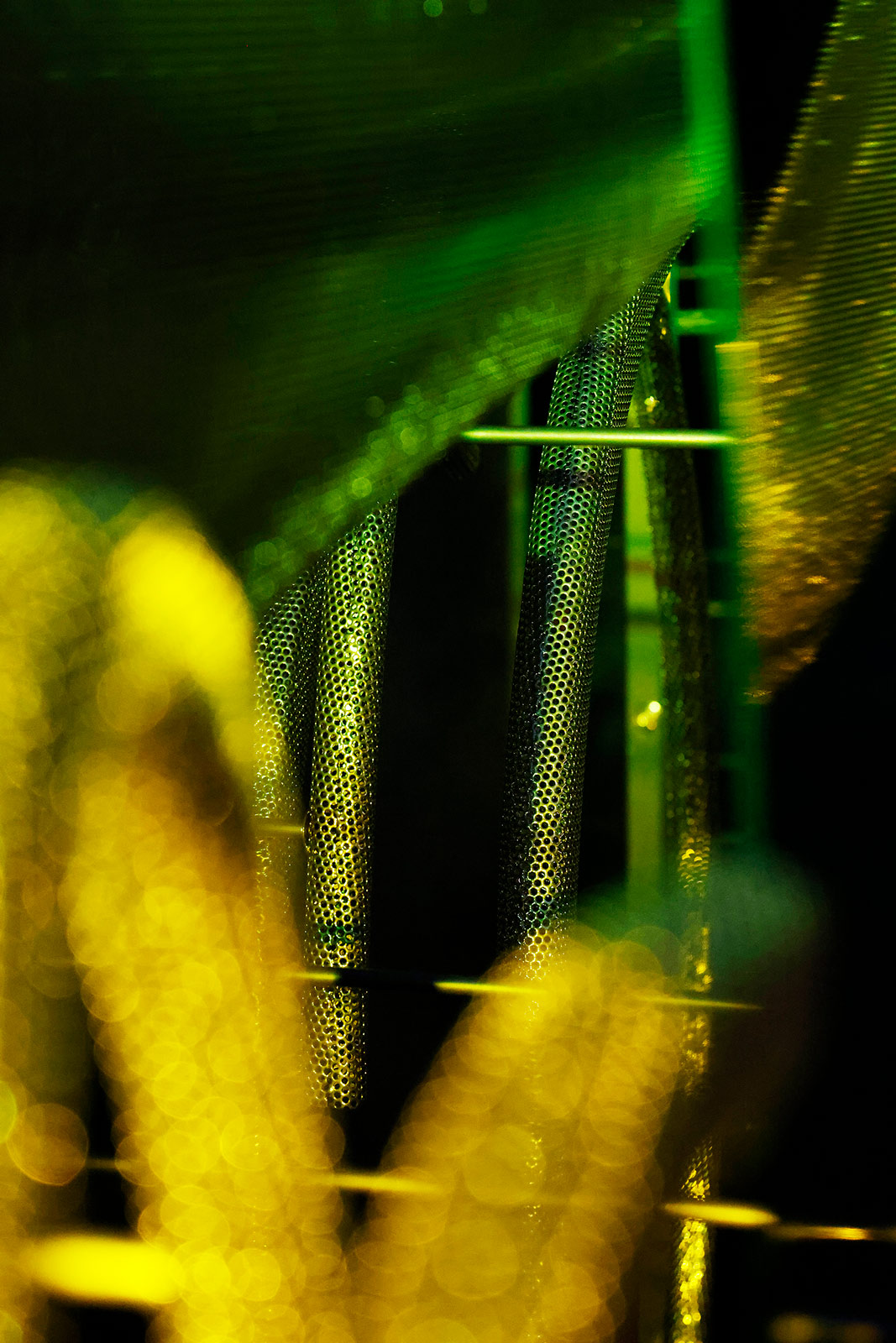
I came up with metal, because that represents the car. We found locally-sourced metal companies that would make everything, and then I worked with the fabrication people. It’s perforated metal. It’s aluminum and steel. They had to be powder coated, because they have to be durable outside. It’s a chemical process. I wanted to dematerialize that and make it as ethereal as possible, and define it with light. Then, [I wanted to] create this mystery about it, so that it catches your eye from a neuroaesthetic perspective—really using the mist and the light to trick your brain into paying attention. It keeps moving to allow you to think of this interplay of light and air and nature.
“When I was growing up in India, I had this epiphany that my house was making me a different person than my friends. From that time, I’ve thought about the power of a space, the power of an experience, and that carries through in all of my work.”
Ann: What do you want the viewer to think about while they’re looking at it?
Suchi: I want the viewers to think about how everything we make has to be in conversation with its environment, and how we, as humans, are in conversation with our environment. That’s what I want them to think about.
Ann: What are you working on personally in your practice at the moment?
Suchi: We’re working on a couple of research projects. We’re working on a neurodiversity project—like, how to create a design toolkit for making spaces for neurodiverse people. Anything from people with ADHD to dyslexia to anything else, but also neurotypical people. We’re doing a retail brand that we’re going to create a flagship for. We’re building a couple of houses that are in construction, some apartments, and I have two or three other installations coming up for next year.
Ann: Designing the Google interiors in Chelsea, what kind of brief did they give you? How did you want the space to function?
Suchi: They didn’t have a physical presence before; it was a completely digital brand. And they needed to be brought into the physical world. That’s exactly the kind of perverse problem that I like to solve. I was intrigued by it. When we talked to all of the teams, they wanted the sense of play, the sense of wonder. And the space itself is super long and narrow, which isn’t great for retail, to be honest.
I created an installation in the middle of the space—this drawing of this black wireframe that connects all these rooms. I wanted to make it an anti-tech space, in the sense that I didn’t want it to be white and shiny and aspirational. I wanted it to be warm, like you can go in there and exhale, and you can hang out, find something funny. The screens weren’t screens; they’re dematerialized screens, so that you can see through them, and you can see the objects in them. It’s about play. It’s about discovery. To make it out of wood felt much more textural. The idea that technology is part of your life is something that I wanted to bring across there. Not that it’s, like, this shiny thing outside of you—that somehow, you have to pretend that you’re going to be this alien to own that object, or that it gives you an alien power. I wanted to emphasize the fact that technology emphasizes our humanness.
Ann: When you design residential spaces, where do you find the balance between living in harmony with technology and not having it consume you?
Suchi: It all comes down to us, to our self-awareness and our wisdom. The piece that I did at The Smithsonian, it’s called me + you, and it uses artificial intelligence. I asked people to give me a word for their future, and I reflected it back to them in lights—and then I show them how all their lights are going together to make a central total, so that their vision of the future is affecting everybody. I was thinking about how we can co-evolve with technology, and that this doom and gloom thing is in our hands to control. It’s about us. I want to emphasize self-awareness, human growth; that’s really what’s the most inspiring to me.


