John Holmstrom and Peter Saville give the stories behind the album covers for the Ramones’s, Joy Division, and New Order.
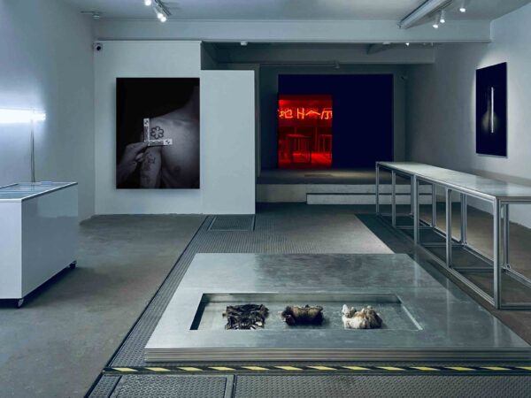
With the rebellious invention of punk in the early 1970s came, not just a musical genre that was a response to the mainstream rock and roll of the era, but an entirely new movement based upon a DIY anti-establishment ethos. It was not just the music itself that captured the zeitgeist of the time, but also the wild graphics that covered punk albums and ephemera. The Museum of Arts and Design (MAD) in New York has an exhibition on view through August 18 titled Too Fast to Live, Too Young to Die: Punk Graphics, 1976–1986 that looks at the punk and post-punk movements through the graphic design that helped define them.
“Too Fast to Live, Too Young to Die charts punk’s explosive impact on design and examines its complex relationship with art, history, and culture,” said Chris Scoates, the director of MAD. “Punk questioned everything, and it’s that spirit of inquiry that is driving MAD forward today, presenting and debating innovative works and ideas with lots of energy, color, and noise.”
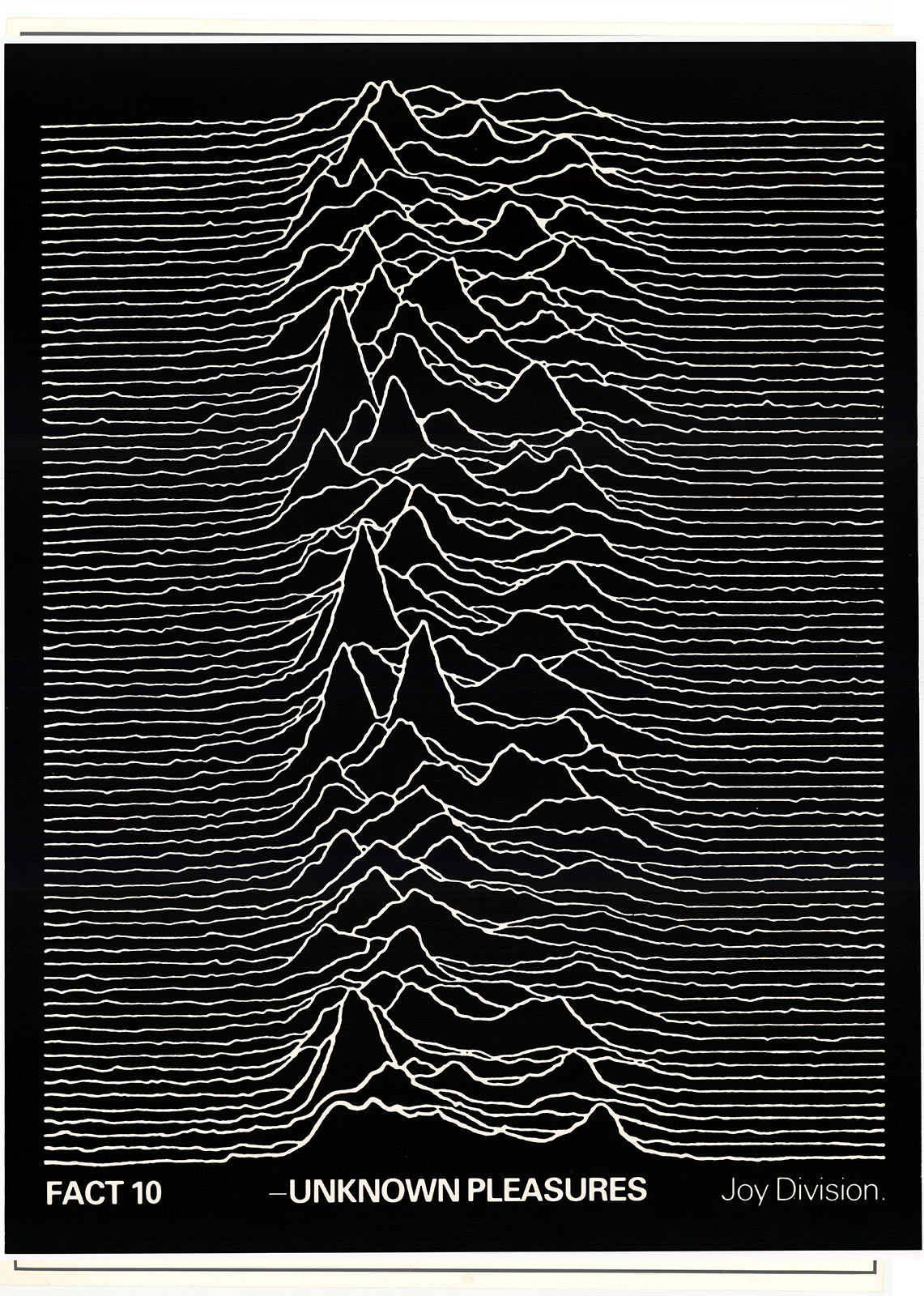
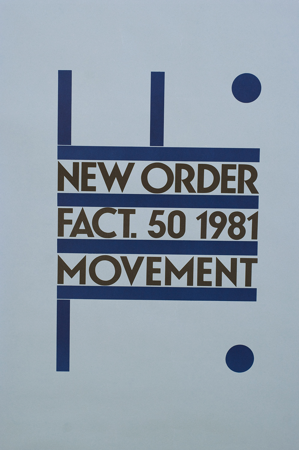
The exhibition features over 400 works including flyers, posters, album art, zines, and more. The now-iconic album covers and graphics that stemmed from that era remain embedded in pop culture as a symbol of the time; who can forget Jamie Reid’s iconic image of Queen Elizabeth in front of the Union Jack for Sex Pistols single “God Save the Queen”? Document spoke to two of the names behind some of the most legendary punk album covers: John Holmstrom, who illustrated the cover of the Ramones’s 1978 album, Road to Ruin, and Peter Saville, the designer behind album covers including Joy Division’s 1979 album Unknown Pleasures and New Order’s 1981 album Movement, about the stories behind the seminal graphics.
John Holmstrom, illustrator of the cover of the Ramones’s Road to Ruin, 1978
Probably the one thing I haven’t mentioned many times before is how often that the image has been used in parodies and tributes and on Ramones merchandise. A custom guitar used the image, then there’s the Joey Ramone bobblehead doll that recreated his image for the doll, the pizza place that used it for their menu, and so on. Also, so many bands have asked me to draw them in that famous “Ramones Road To Ruin” pose. For instance, The Boogers [a band that performs for grade school kids] uses a RTR parody image for every one of their album covers! It’s nice to be associated with a famous image like this, it was the only record cover design I illustrated until Murphy’s Law hired me to draw a cover for The Best of Times in the late 1980s. I always thought the cover looked so good that I would get more work drawing record covers but that never happened. I guess I was too associated with Ramones to get other bands to hire me after this.
Peter Saville, designer of the Joy Division album cover Unknown Pleasures, 1979
I created the artwork for the cover before I had actually heard the album, and delivered it to their manager Rob Gretton the day he had received a test pressing. He invited me to listen and I was somewhat reticent as the first recordings I’d heard by Joy Division were quite raw, but obviously under the circumstances I couldn’t decline his offer. From the first track I was astonished by what Martin Hannett had conjured with the group. From beginning to end it was remarkable and it remains so to this day. The image itself depicts radio waves emitted from a collapsed star. The original pulse, detected by astrophysicist Jocelyn Bell Burnell at Cambridge University in 1967, was named CP1919 and was later recognized as the first Pulsar. The signal was captured on a plotter as one long, continuous line, but was then enhanced and reformatted in layers by researchers from Cornell University in order to show the frequency and symmetry of the pulses which appeared every 1.337 seconds. The original image was discovered by Bernard Sumner in the Cambridge Encyclopedia of Astronomy (2nd edition, 1978). I reversed the colors as found in the publication to create white waves on a black background. In a radical move for the time, all text is absent from the front cover, leaving an enigmatic image floating in black space, a timeless image of a dead star.
Saville, on designing the Joy Division album Closer, 1980:
The poster in the MAD exhibition is not by me but based on the cover I designed in 1980. Again, I had not heard the album but at a meeting with the group they shared my interest in a photograph by French photographer Bernard Pierre Wolff (1930–1985). I first saw the image in the magazine Zoom and assumed it to be fabricated, that Wolff had staged the setting to create a postmodern neoclassical tableaux. It wasn’t until much later, when the cover had taken on cult status, that the actual sculpture was tracked down to the Appiani family tomb in Cimitero Monumentale di Stagglieno, Genoa, where there is a tradition of elaborate funerary statuary for family tombs. Within weeks of our collective decision on the cover, Ian Curtis had died. I was immediately aware that the imagery would take on controversial significance, but as it had been agreed upon before Ian died, the decision was made to honour the original concept. On reflection, there is an uncanny prescience to my proposition in light of the events that followed.
Saville, on conceptualizing the 1981 New Order album Movement:
The design of Movement directly quotes Italian Futurist artist Fortunato Depero’s poster for the 1932 exposition Futurismo Trentino. For me, [the album] title Movement and Futurism seemed analogous: Futurism celebrated the energy and speed of modernity and industry, which I referenced with a degree of irony for music created on the cusp of a post-industrial world in 1980, when the remaining members of Joy Division, reconstituted as New Order, were dynamically forward-moving. It seemed entirely appropriate at the time to make this quotation and I remember optimistically imagining that Futurist founder Filippo Tommaso Marinetti (1876-1944) would have approved.


